A Novice Takes a Stab at GIS – Part 3

At this point in my entry-level upskilling project, the ground work has been done. I have a polygon of the Chesapeake Bay laid over an OpenStreetMap layer and I know how to change the color of it. Going back to the initial post, my hope with this project is to show change over time in the crab population of the Bay. As a complete novice, I don’t even know if there’s a way for me to do that in QGIS, or if I’m going to make 15 different maps with the 15 years of data and turn images of them into a .gif. So, I went back to ChatGPT for guidance. 

It also told me I could use style changes by time attribute, the TimeManager Plugin, or the manual process I had considered doing with turning a series of images into a .gif. 

I’ll be using the Temporal Controller since it was the first option. I asked ChatGPT for a step-by-step guide of how to do this.

Before getting bogged down in the process of creating the visualization, it’s important to have my data prepped and ready to go. I asked ChatGPT how it needed to be set up in order to use the temporal controller function.

In this case, I’ve decided to not do the thing that ChatGPT says is easier. The “Join External Time Data to Polygon” option seems to involve more data preparation work and be a better process to know for future projects. I began by taking a screen capture of the data table from the Maryland DNR’s Winter Dredge Survey history, uploaded it into ChatGPT, and had it use its OCR capabilities to make a table that I could paste into Excel and save as a .csv.

Step 1. 

Step 2. 

Step 3. 

After looking back at some of the steps in the process of using the temporal controller (Step 2 above), the final product ended up looking like this. I went into the attribute table of the polygon and saw that it already had an assigned ID of “2250”, so I added that column. Additionally, the geometry type is a polygon so that was added, as well.

With that, data preparation was complete and now I’m ready to move on to joining the data table to the polygon and creating the visualization. 

A Novice Takes a Stab at GIS – Part Two

Last week, I was able to settle on what the map I was creating would illustrate and find trustworthy data to use. This week, the focus is on actually creating the map itself. To do this, I need shapefiles of the Chesapeake Bay Watershed. 

I was able to source one from the Chesapeake Bay Program at data-chesbay.opendata.argis.com. This took me a handful of tries as most of the publicly available shape files of the Bay are a polygon of all the land and water considered to be within the Chesapeake Bay watershed. For the purposes of this map, I was looking for just the water itself. 

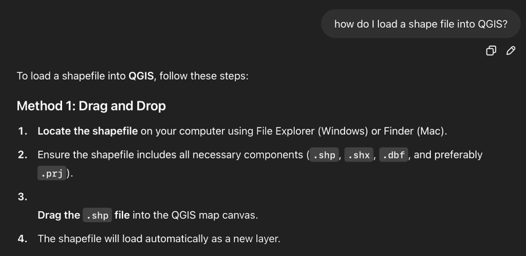
As a reminder, this is a self-guided process where I’m using ChatGPT to guide me through learning how to use QGIS. I’ve never loaded a shapefile before and ChatGPT gave me clear instructions.

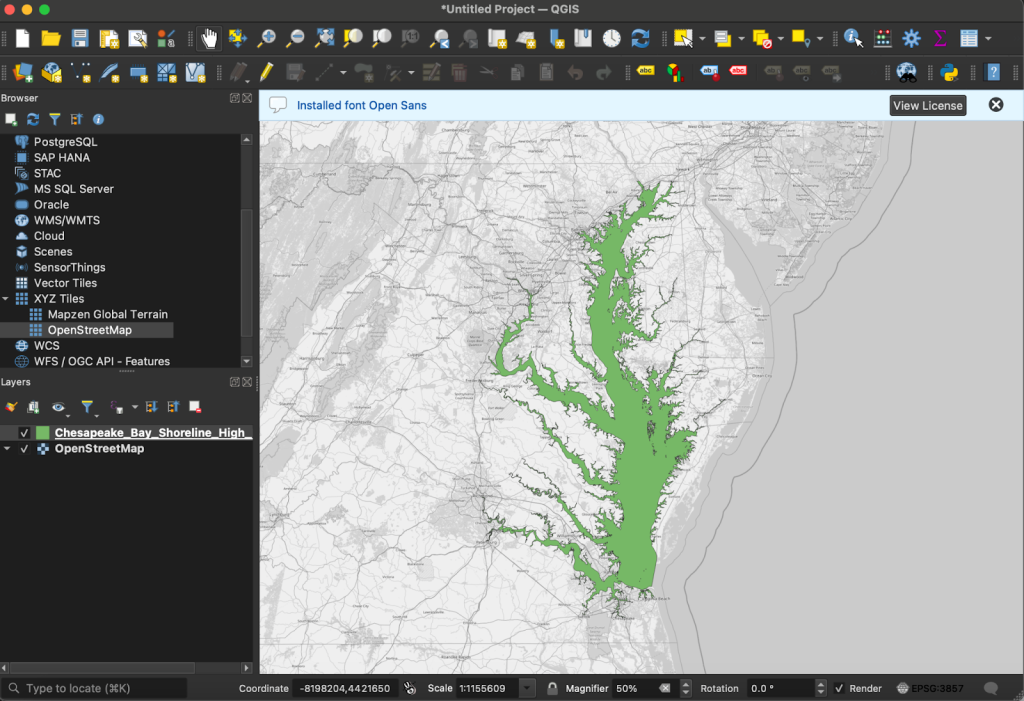
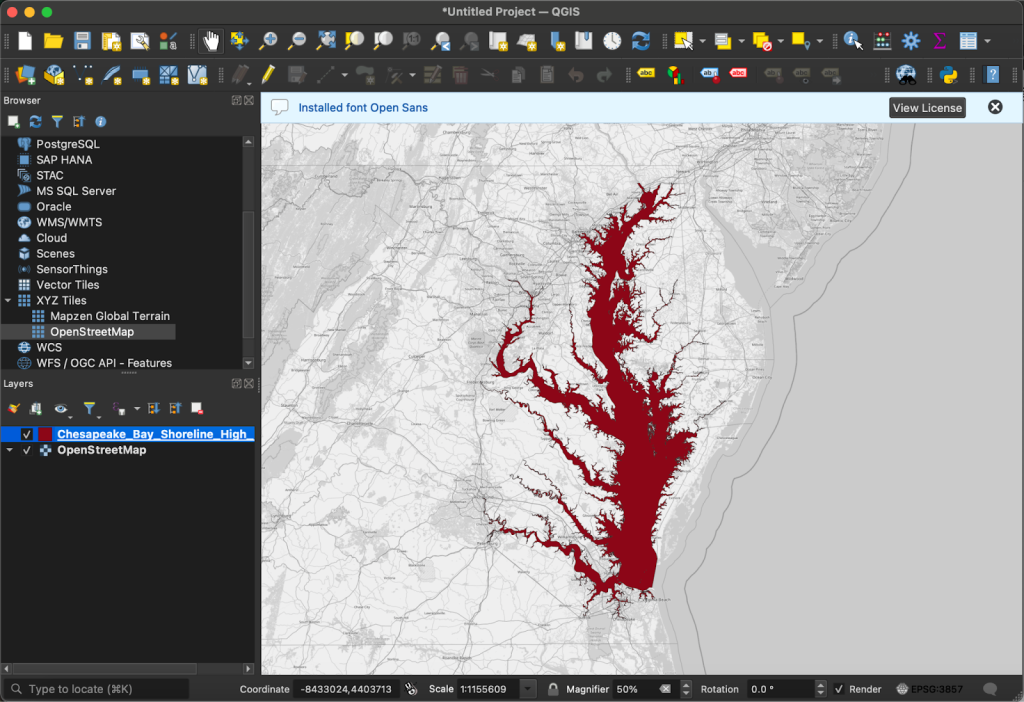
In order to load the shapefile into QGIS, I dragged the downloaded folder, which included .shp, .xml, .shx, .prj, .dbf, and .cpg files, into a blank new project. I felt a brief moment of triumph before realizing that getting the land surrounding the Bay into the project would likely not be as simple, but it was actually even easier. 

QGIS has an OpenStreetMap layer built into the “XYZ Tiles” tab on the left side of the window. I turned it on, reordered the layers so that my shapefile of the water was over top of OSM, and that was all that needed to be done. The program had already lined up the shapefile of the Bay itself perfectly with where OSM had the Bay. 

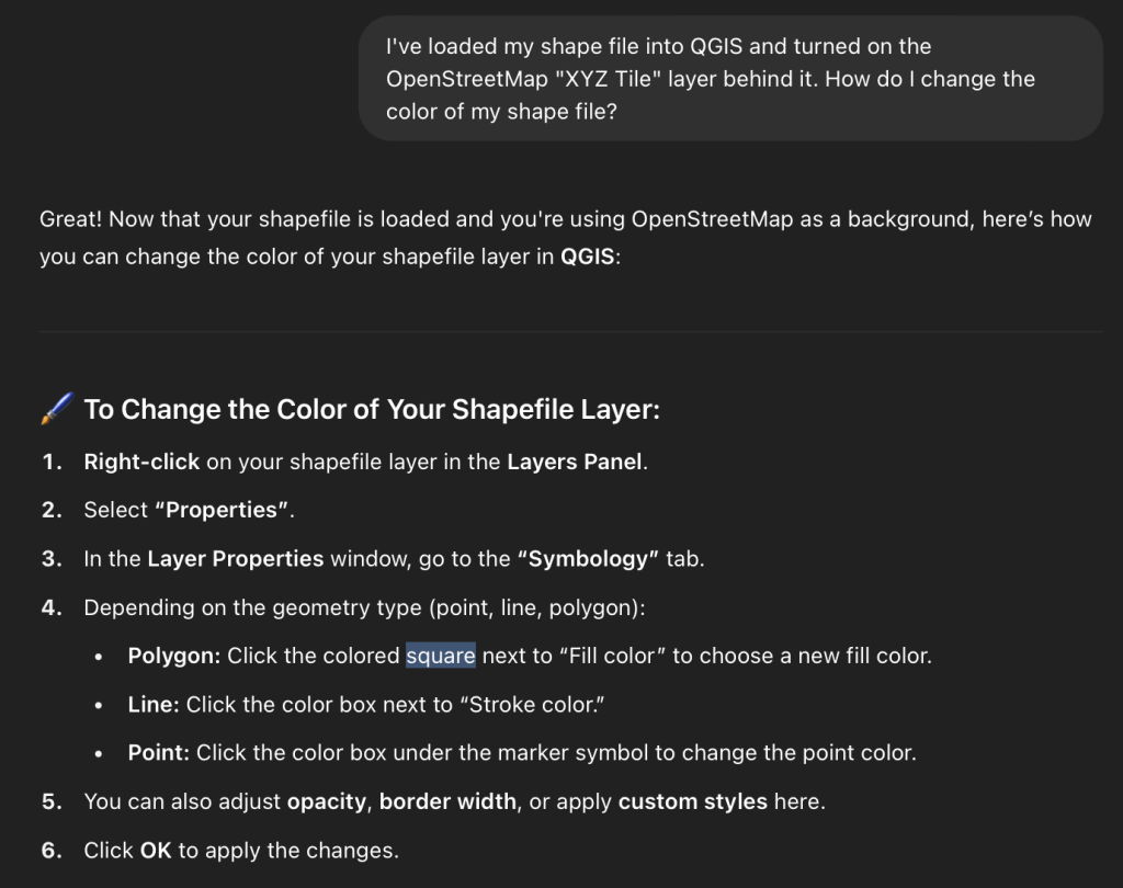
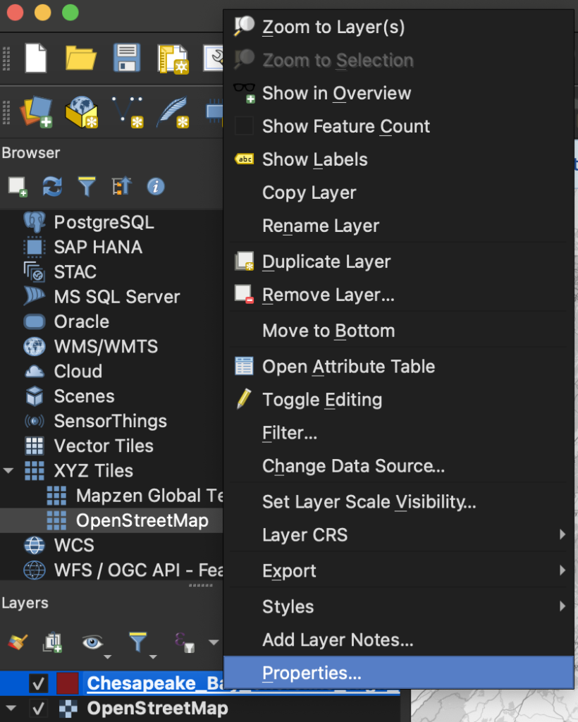
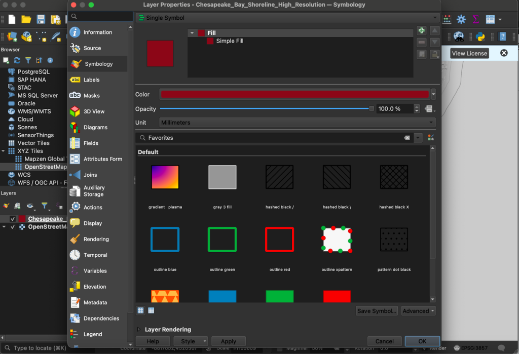
Now it’s time to go back to Professor ChatGPT. I need to know how to change the color of the shapefile before I can even worry about assigning different colors to different levels of crab population, finding out how to automatically change the color based on data in a table, or anything else. 

Just to practice, I made the Bay crimson. 

Step 1. 

Step 2.

Step 3.

In my next post, I’ll be going back to ChatGPT to learn how I can set up a table of data and instruct QGIS to change the color of the water based on the data in said table. I’m not sure how that will work or look yet, but that’s part of the learning. 

Reframing Location Intelligence From Where to Why

Location intelligence is becoming increasingly central to enterprise analytics, with organizations in sectors such as retail, logistics, and financial services integrating geospatial data into decision-making systems. A 2016 McKinsey report projected that data-driven decision-making could generate trillions in economic value, with location data playing a key role in operational and strategic improvements (Manyika et al., 2016). Yet too often, location intelligence stops at the “where” , relying on maps, heatmaps, and dashboards that answer where events occur but fail to uncover why they happen. In a world where spatial data is richer and more interconnected than ever, it’s time to reframe the question.

Beyond Map-Centric Thinking

In a previous post, we explored how geospatial thinking often extends beyond visual maps and into the structure of the data itself. This post builds on that perspective by examining how organizations can move from observing where things happen to understanding why they happen.

Traditional geospatial tools have served us well by constructing maps from layers of information , showing us densities, boundaries, and movements. But these layers often describe what is happening, not what is causing it. They prioritize representation over interpretation.

As geographer Rob Kitchin observed, data infrastructures are shaped by what they are designed to reveal , and too often, spatial tools are built around display rather than reasoning (Kitchin, 2014). A map may show that customer churn is higher in certain neighborhoods, but it won’t explain the underlying factors , such as infrastructure decay, service gaps, or shifting demographics. The real opportunity lies not in seeing where something happens, but in understanding why it happens there , and what to do about it.

Why ‘Why’ Matters

In this context, understanding why means uncovering the underlying factors, influences, and sequences that drive spatial events. This goes beyond simply observing patterns to reveal the relationships and conditions that cause them. At its core, this means identifying causal factors (what directly or indirectly triggers an event), recognizing spatial influence (how neighboring locations or connected networks impact outcomes), and analyzing temporal sequences (how events unfold over time and shape one another).
To uncover the why, organizations must expand beyond latitude and longitude. They must analyze relationships, influences, and sequences that affect outcomes. This means incorporating spatial-temporal data, behavioral context, and causal modeling into their workflows.

For example:

  • Why do outages cluster in specific parts of a grid?
  • Why do certain stores underperform despite high foot traffic?
  • Why does a transportation route fail under specific weather conditions?

These questions require a shift from descriptive to diagnostic and predictive reasoning. As Harvey Miller emphasized in his work on time geography, it’s essential to understand how entities move through space over time , and how those movements interact (Miller, 2005).

Enabling the Shift from Where to Why

Several techniques support this evolution:

  • Spatial-temporal modeling captures how patterns change over time and space, useful for everything from crime forecasting to disease tracking.
  • Graph-based spatial reasoning allows entities to be analyzed in networks of relationships , for example, how upstream supply chain disruptions propagate downstream.
  • Machine learning models can incorporate spatial lag and neighborhood context as predictive features, treating geography as more than metadata.

Spatial-temporal modeling has proven essential in forecasting dynamic phenomena such as urban crime, traffic congestion, and disease spread. For instance, spatial-temporal models were central to COVID-19 response strategies, enabling public health officials to predict transmission hotspots and allocate resources accordingly (Yang et al., 2020).

Graph-based spatial reasoning enhances the ability to model systems as interconnected networks rather than isolated locations. This is especially useful in domains like disaster response and logistics. Recent research by Attah et al. (2024) explores how AI-driven graph analytics can improve supply chain resilience by revealing hidden interdependencies and points of failure across logistics networks.

Machine learning techniques are increasingly integrating spatial features to improve prediction accuracy. By incorporating spatial lag , the influence of neighboring observations , models can more accurately predict property values, infrastructure failure, or customer churn. The PySAL library, for example, supports spatial regression and clustering techniques that extend traditional ML approaches to account for spatial dependence (Rey & Anselin, 2010).

A wide range of modern technologies now support advanced spatial reasoning and spatio-temporal analytics at scale. These include open-source databases like PostgreSQL with PostGIS for spatial querying, graph databases such as Neo4j for topological reasoning, and analytical libraries like PySAL for spatial econometrics and clustering. Complementing these are cloud-native tools and formats that enhance scalability, flexibility, and real-time responsiveness. Columnar storage formats like Parquet and Zarr, distributed processing frameworks such as Apache Spark and Delta Lake, and streaming platforms like Kafka all enable organizations to model space and time as interconnected dimensions , moving beyond static maps toward continuous, context-aware decision-making.

Such methods shift the focus from identifying where something happened to uncovering why it happened by revealing the spatial dependencies, temporal sequences, and system-level interactions that drive outcomes. Far from being merely theoretical, these techniques are already delivering measurable impact across a wide range of sectors including public health, logistics, urban planning, and infrastructure. Organizations that embrace them are better positioned to make timely, data-driven decisions grounded in a deeper understanding of cause and context.

How Cercana Helps

At Cercana Systems, we help clients build deep-stack geospatial solutions that go beyond visualization. Our expertise lies in:

  • Designing data architectures that integrate spatial, temporal, and behavioral signals
  • Embedding spatial relationships into data pipelines
  • Supporting location-aware decision-making across logistics, infrastructure, and public services

We help clients uncover the deeper patterns and relationships within their data that inform not just what is happening, but why it’s happening and what actions to take in response.

Conclusion

The future of location intelligence lies not in better maps, but in better questions. As spatial data grows in scope and complexity, organizations must look beyond cartography and embrace spatial reasoning. Reframing the question from “Where is this happening?” to “Why is this happening here?” opens the door to more strategic, informed, and adaptive decision-making.

References

Attah, R. U., Garba, B. M. P., Gil-Ozoudeh, I., & Iwuanyanwu, O. (2024). Enhancing supply chain resilience through artificial intelligence: Analyzing problem-solving approaches in logistics management. International Journal of Management & Entrepreneurship Research, 6(12), 3883–3901. https://doi.org/10.51594/ijmer.v6i12.1745

Kitchin, R. (2014). The data revolution: Big data, open data, data infrastructures and their consequences. SAGE Publications. https://doi.org/10.4135/9781473909472

Manyika, J., Chui, M., Brown, B., et al. (2016). The age of analytics: Competing in a data-driven world. McKinsey Global Institute. https://www.mckinsey.com/capabilities/quantumblack/our-insights/the-age-of-analytics-competing-in-a-data-driven-world

Miller, H. J. (Harvey J.) (2005). A measurement theory for time geography. Geographical Analysis, 37(1), 17–45. https://doi.org/10.1111/j.1538-4632.2005.00575.x

Rey, S. J., & Anselin, L. (2010). PySAL: A Python library of spatial analytical methods. In Handbook of Applied Spatial Analysis (pp. 175–193). Springer. https://doi.org/10.1007/978-3-642-03647-7_11

Shekhar, S., Evans, M. R., Gunturi, V. M., Yang, K., & Abdelzaher, T. (2014). Spatial big-data challenges intersecting mobility and cloud computing. 2012 NSF Workshop on Social Networks and Mobility in the Cloud. http://dx.doi.org/10.1145/2258056.2258058Yang, W., Zhang, D., Peng, L., Zhuge, C., & Hong, L. (2020). Rational evaluation of various epidemic models based on the COVID-19 data of China. Mathematical Biosciences and Engineering, 17(3), 3051–3064. https://doi.org/10.1016/j.epidem.2021.100501

A Novice Takes a Stab at GIS

For the last handful of months, I’ve been working with my father’s company, Cercana Systems, to assist with content marketing and business development. In college, I finished most of a public relations degree at The University of Alabama before the first of my two daughters graced us with her presence and we decided to move back home to Maryland in order for her to actually have her extended family in her life. Since that time, I’ve found myself wanting more and more to find a way to help build things that provide a more tangible contribution to the world around me. Then, two weeks ago, I had the opportunity to attend FedGeoDay 2025 and decided it was time to start teaching myself some novice-level GIS skills. 

This year’s FedGeoDay theme of “open resilience” brought out a host of presenters that were using open geospatial ecosystems to do highly critical work in disaster prediction, preparation, and response. Everyone there was doing work that was well worth doing.

That brings us to the purpose of this blog post. It is the first in a series of undetermined length about me teaching myself how to use QGIS as a first foray into learning GIS skills. I am a complete novice with no coding or technical background of any kind. My hope is that documenting the process of attempting to make my first data-visualization in a commonly used tool may help others that want to delve into the field get past any apprehension they have about getting off the starting block. 

Step 1 – Pick a topic and find data

Initially, I had wanted to create a handful of heat maps that showed the change in the number of youth lacrosse programs in the mid-atlantic over the last 15 years. I turned to Chat GPT to source the data, but the engine was unable to find historical records for me to use.

“I want to build a heat map showing change over time in the concentration of youth lacrosse programs in the states of Maryland, Virginia, Delaware, New Jersey, Pennsylvania, North Carolina, West Virginia, and the District of Columbia. Could you scour the internet for data that I can use for this and put the data in a spreadsheet? The spread sheet should have three columns. The first column will indicate the year, the second will indicate the county, and the third should indicate the number of youth teams in that county. Let’s look at Spring teams only, not Fall, Winter, or Summer. Data should go back 15 years (2010-2025). Let’s consider “youth lacrosse” to be teams for children as old as 8th grade or 14 years of age. Some teams will use the “under X” age categorization, some will use the projected year of high school graduation, and some will just indicate a standard age range or grade level for the children it caters to, so be sure to look out for all of those. Can you do this?”

Compiling a comprehensive dataset detailing the number of youth lacrosse teams by county from 2010 to 2025 across Maryland, Virginia, Delaware, New Jersey, Pennsylvania, North Carolina, West Virginia, and the District of Columbia presents significant challenges. The primary hurdle is the lack of publicly available, granular historical data spanning this 15-year period. While some organizations provide current information, historical records at the county level are scarce.

### Available Data and Resources

* **Maryland Youth Lacrosse Association (MYLA)**: Oversees youth lacrosse in Maryland, offering current season details and age groupings. However, historical data by county is not readily accessible on their website. ([mylalax.com][1])

* **Western Maryland Youth Lacrosse Conference (WMYLC)**: Covers counties in Western Maryland and parts of neighboring states, with a focus on promoting youth lacrosse. Specific team counts by county and year are not provided online. 

* **Anne Arundel County Recreation and Parks**: Provides detailed information on current boys’ lacrosse leagues, including age divisions and game schedules. Historical data is not available on their platform. ([Anne Arundel County Government][2])

* **Inside Lacrosse Articles**: Discuss trends in lacrosse participation, noting shifts in player demographics and regional growth. These articles offer insights but lack specific county-level data over the desired time frame. ([Inside Lacrosse][3])

### Challenges in Data Compilation

* **Data Availability**: Most organizations do not maintain or publicly share historical team counts by county.

In the real world, sourcing and compiling accurate data can often be the bulk of the work done on a GIS project. However the point of this pursuit is to learn how to use QGIS, not spend countless hours calling up the Parks and Rec department of every county in the Mid-Atlantic, so I decided to pivot to something else.

So now, I’m looking for historical data over the last 15 years on the blue crab population in various sections of the Chesapeake Bay estuary. My new goal will be to create one map that shows the places where the population has increased the most, increased the least, and even decreased since 2010. 

This information was readily available from Maryland’s Department of Natural Resources, with one caveat. 

There was plenty of data on blue crab population available, but I wasn’t finding any that was split up into certain regions of the bay. Nonetheless, creating the map and shading the entire Bay based on percent change in population density from the median of the data year-to-year is a good beginner project to learn anything about QGIS at all, so we’re rolling with it. 

Step 2 – Installing QGIS

While it may seem like a silly step to document, this is supposed to be a properly novice guide to making a map in QGIS, and it’s a touch difficult to do that without installing the program. The machine I’m using is a 2020 M1 Macbook Air running Sonoma 14.6.1. I downloaded the installer for the “long term” version of QGIS from qgis.org, went through the install process, and attempted to open it. 

Naturally, my Macbook was less than thrilled that I was attempting to run a program that I hadn’t downloaded from the app store. It was completely blocking me from running the software when I opened it from the main application navigation screen. This issue was resolved by going to the “Applications” folder in Finder and using the control+left click method. A warning popped up about not being able to verify that the application contained no malware, I ran it anyway, and I have not had any issues opening the application since then. 

The next step will be to actually crack QGIS open and begin creating a map of the Chesapeake Bay. 

Geospatial Without Maps

When most people hear “geospatial,” they immediately think of maps. But in many advanced applications, maps never enter the picture at all. Instead, geospatial data becomes a powerful input to machine learning workflows, unlocking insights and automation in ways that don’t require a single visual.

At its core, geospatial data is structured around location—coordinates, areas, movements, or relationships in space. Machine learning models can harness this spatial logic to solve complex problems without ever generating a map. For example:

  • Predictive Maintenance: Utility companies use the GPS coordinates of assets (like transformers or pipelines) to predict failures based on environmental variables like elevation, soil type, or proximity to vegetation (AltexSoft, 2020). No map is needed—only spatially enriched feature sets for training the model.
  • Crop Classification and Yield Prediction: Satellite imagery is commonly processed into grids of numerical features (such as NDVI indices, surface temperature, soil moisture) associated with locations. Models use these purely as tabular inputs to predict crop types or estimate yields (Dash, 2023).
  • Urban Mobility Analysis: Ride-share companies model supply, demand, and surge pricing based on geographic patterns. Inputs like distance to transit hubs, density of trip starts, or average trip speeds by zone feed machine learning models that optimize logistics in real time (MIT Urban Mobility Lab, n.d.).
  • Smart Infrastructure Optimization: Photometrics AI employs geospatial AI to enhance urban lighting systems. By integrating spatial data and AI-driven analytics, it optimizes outdoor lighting to ensure appropriate illumination on streets, sidewalks, crosswalks, and bike lanes while minimizing light pollution in residential areas and natural habitats. This approach not only improves safety and energy efficiency but also supports environmental conservation efforts (EvariLABS, n.d.).

These examples show how spatial logic—such as spatial joins, proximity analysis, and zonal statistics—can drive powerful workflows even when no visualization is involved. In each case, the emphasis shifts from presenting information to enabling analysis and automation. Features are engineered based on where things are, not just what they are. However, once the spatial context is baked into the dataset, the model itself treats location-derived features just like any other numerical or categorical variable.

Using geospatial technology without maps allows organizations to focus on operational efficiency, predictive insights, and automation without the overhead of visualization. In many workflows, the spatial relationships between objects are valuable as data features rather than elements needing human interpretation. By integrating geospatial intelligence directly into machine learning models and decision systems, businesses and governments can act on spatial context faster, at scale, and with greater precision.

To capture these relationships systematically, spatial models like the Dimensionally Extended nine-Intersection Model (DE-9IM) (Clementini & Felice, 1993) provide a critical foundation. In traditional relational databases, connections between records are typically simple—one-to-one, one-to-many, or many-to-many—and must be explicitly designed and maintained. DE-9IM extends this by defining nuanced geometric interactions, such as overlapping, touching, containment, or disjointness, which are implicit in the spatial nature of geographic objects. This significantly reduces the design and maintenance overhead while allowing for much richer, more dynamic spatial relationships to be leveraged in analysis and workflows.

By embedding DE-9IM spatial predicates into machine learning workflows, organizations can extract richer, context-aware features from their data. For example, rather than merely knowing two infrastructure assets are ‘related,’ DE-9IM enables classification of whether one is physically inside a risk zone, adjacent to a hazard, or entirely separate—substantially improving the precision of classification models, risk assessments, and operational planning.

Machine learning and AI systems benefit from the DE-9IM framework by gaining access to structured, machine-readable spatial relationships without requiring manual feature engineering. Instead of inferring spatial context from raw coordinates or designing custom proximity rules, models can directly leverage DE-9IM predicates as input features. This enhances model performance in tasks such as spatial clustering, anomaly detection, and context-aware classification, where the precise nature of spatial interactions often carries critical predictive signals. Integrating DE-9IM into AI pipelines streamlines spatial feature extraction, improves model explainability, and reduces the risk of omitting important spatial dependencies.

Harnessing geospatial intelligence without relying on maps opens up powerful new pathways for innovation, operational excellence, and automation. Whether optimizing infrastructure, improving predictive maintenance, or enriching machine learning models with spatial logic, organizations can leverage these techniques to achieve better outcomes with less overhead. At Cercana Systems, we specialize in helping clients turn geospatial data into actionable insights that drive real-world results. Ready to put geospatial AI to work for you? Contact us today to learn how we can help you modernize and optimize your data-driven workflows.

References

Clementini, E., & Felice, P. D. (1993). A model for representing topological relationships between complex geometric objects. ACM Transactions on Information Systems, 11(2), 161–193. https://doi.org/10.1016/0020-0255(95)00289-8

AltexSoft. (2020). Predictive maintenance: Employing IIoT and machine learning to prevent equipment failures. AltexSoft. https://www.altexsoft.com/blog/predictive-maintenance/

Dash, S. K. (2023, May 10). Crop classification via satellite image time-series and PSETAE deep learning model. Medium. https://medium.com/geoai/crop-classification-via-satellite-image-time-series-and-psetae-deep-learning-model-c685bfb52ce

MIT Urban Mobility Lab. (n.d.). Machine learning for transportation. Massachusetts Institute of Technology. https://mobility.mit.edu/machine-learning

EvariLABS. (2025, April 14). Photometrics AI. https://www.linkedin.com/pulse/what-counts-real-roi-streetlight-owners-operators-photometricsai-vqv7c/